

The Quick View module enhances the shopping experience by allowing customers to instantly preview product details in a lightbox popup without navigating away from the shop or category page.
This feature reduces clicks and friction, allowing shoppers to quickly evaluate products and add them to their cart, which can lead to faster purchasing decisions and reduced cart abandonment.
Activating the Quick View Module
To use this feature, you must first activate it from the StoreGrowth dashboard.
- Navigate to StoreGrowth » Modules from your WordPress dashboard.
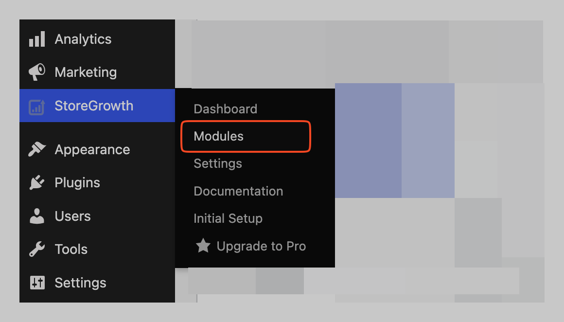
- Find the Quick View module card in the list.
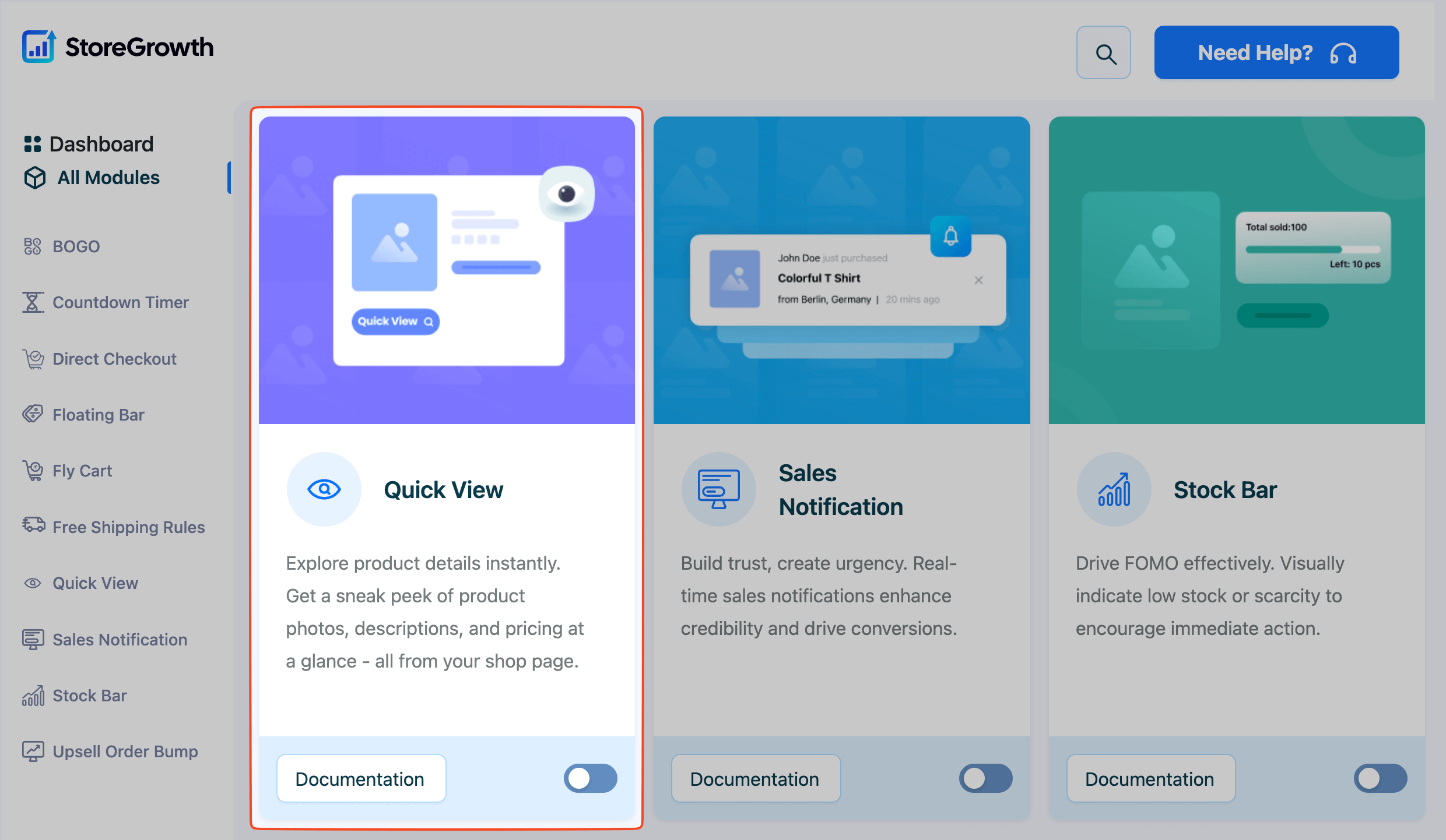
- Click the toggle switch to the “On” position to activate it.
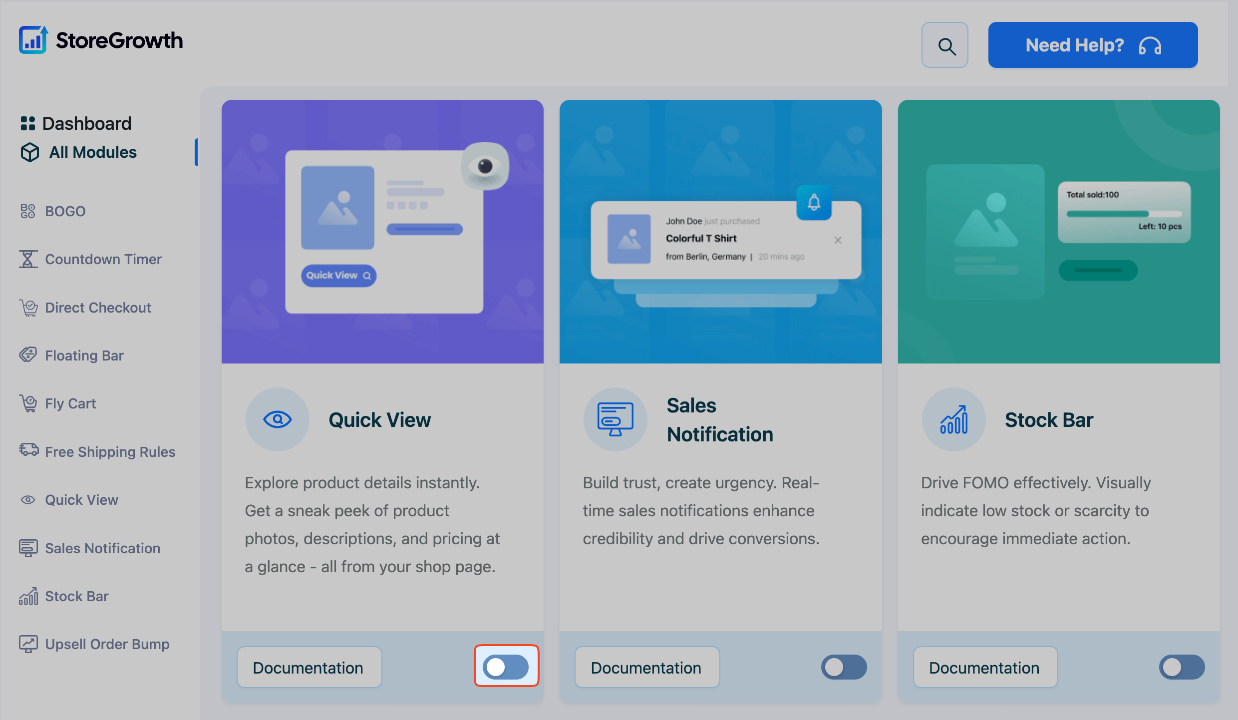
Once enabled, a “Quick View” menu item will appear in the main StoreGrowth sidebar, giving you access to all its settings.
Configuring Quick View Settings
Navigate to StoreGrowth » Modules » Quick View to access the main settings panel. This area is divided into three tabs: General Setting, Button Settings, and Design.
General Setting Tab
This tab controls the core functionality of the Quick View modal, including its behavior, effects, and the content it displays. A live preview on the right side of the screen updates as you make changes.
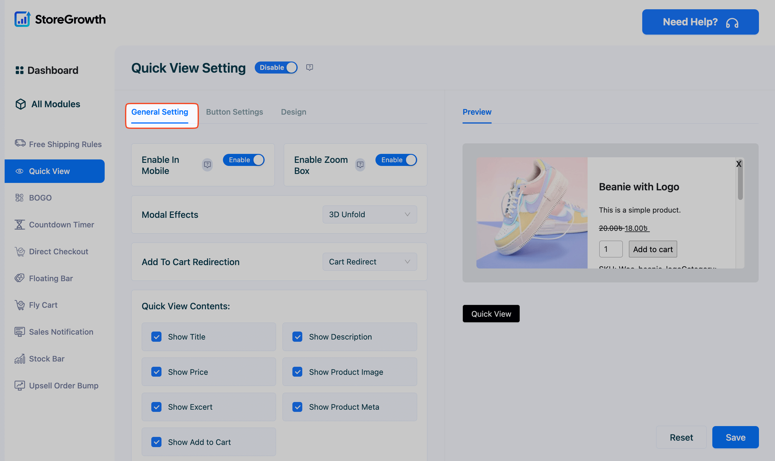
- Enable in Mobile: Toggle this on to allow the Quick View functionality on mobile devices, providing a streamlined experience for smartphone users.
- Enable Zoom Box: When enabled, customers can hover over the product image within the modal to see a magnified, zoomed-in view for greater detail.
- Modal Effects: Choose an animation effect for how the Quick View modal appears when opened. This adds a polished, dynamic feel to the user experience. The options are:
- 3D Unfold: The modal appears with a 3D unfolding animation.
- Zoom Out: The modal shrinks into view.
- Move From Top: The modal slides down from the top of the screen.
- Fade: A simple, clean effect where the modal fades into view.
- Add To Cart Redirection: Decide what happens after a customer adds a product to their cart from within the Quick View modal. The options are:
- Cart Redirect: After adding an item, the customer is taken directly to the full cart page.
- Shop Page Redirect: The customer is redirected back to the main shop page after adding an item.
- Ajax add to cart: The product is added to the cart without a page reload. The modal closes, and the customer remains on the shop/category page, allowing them to continue browsing without interruption.
- Quick View Contents: Select which product details you want to display inside the modal window. You have granular control to show or hide the following elements:
- Show Title: The name of the product.
- Show Description: The full product description.
- Show Price: The product’s price.
- Show Product Image: The main featured image.
- Show Excerpt: The short product description.
- Show Product Meta: Additional information like categories, tags, and SKU.
- Show Add to Cart: The add to cart button and quantity selector.
Button Settings Tab
This tab allows you to configure the appearance, text, and placement of the button that triggers the Quick View modal.
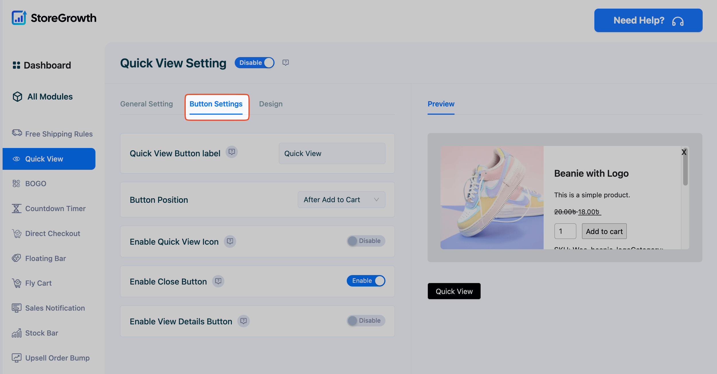
- Quick View Button label: Customize the text that appears on the trigger button (e.g., “Quick View,” “View Details”).
- Button Position: Choose where the Quick View button appears on the product card on shop and category pages. The options are:
- After Add to Cart: Places the button below the main Add to Cart button.
- Before Add to Cart: Places the button above the Add to Cart button.
- Center On The Image: The button appears overlaid in the center of the product image.
- Enable Quick View Icon: When enabled, a small icon will appear alongside the button text for added visual clarity.
- Enable Close Button: Toggle this to show or hide the ‘X’ close button within the Quick View modal. It is highly recommended to keep this enabled for user accessibility.
- Enable View Details Button: When enabled, a “View Details” button will appear inside the modal, providing a clear link for customers to navigate to the full single product page if they want more information.
Design Tab
This tab gives you full control over the styling of the Quick View button and modal window, allowing you to match it perfectly with your store’s branding.
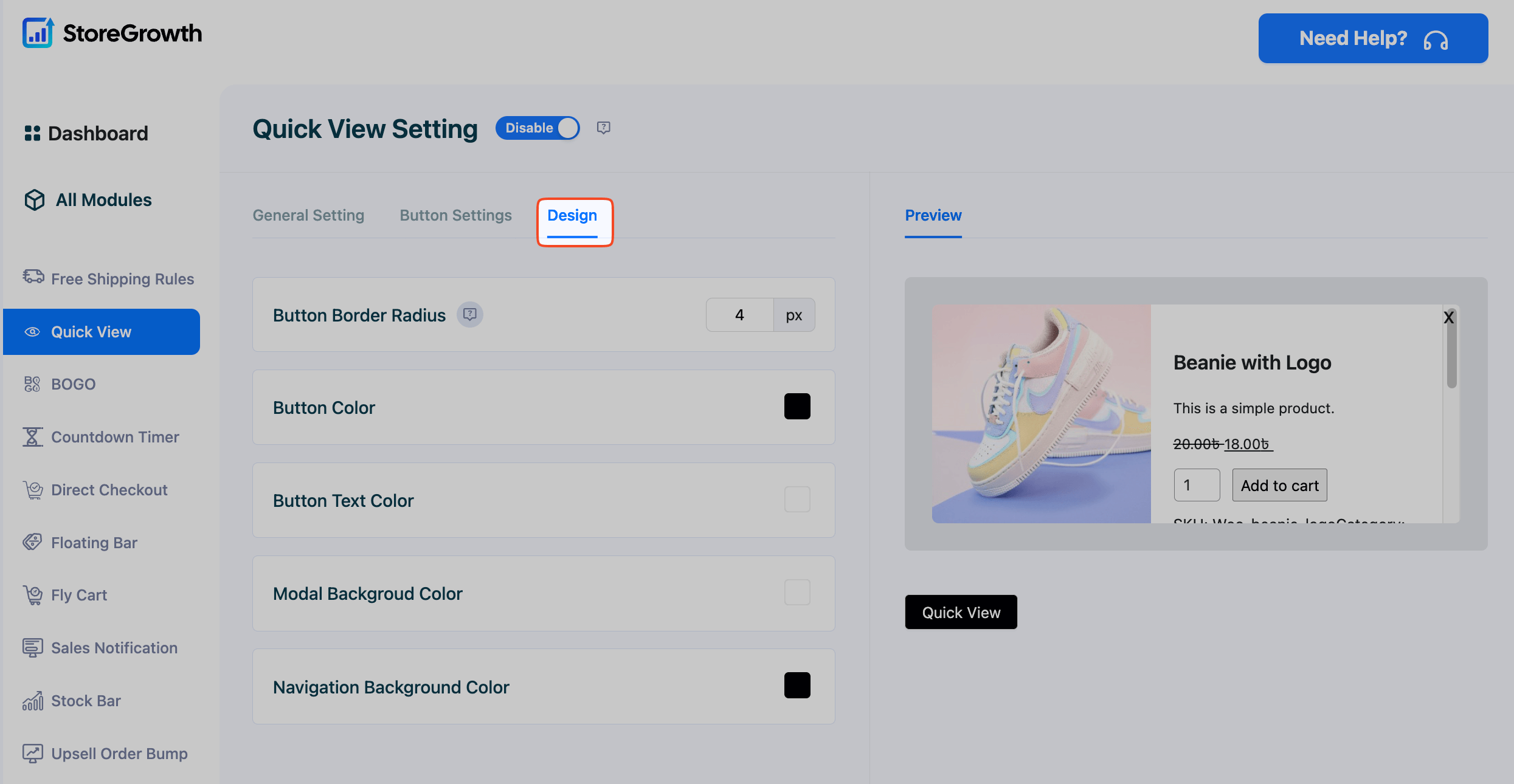
- Button Border Radius: Adjust this value in pixels to control the roundness of the Quick View button’s corners.
- Button Color: Use the color picker to set the background color of the button.
- Button Text Color: Use the color picker to set the color of the button’s text.
- Modal Background Color: Choose the background color for the Quick View modal overlay.
- Navigation Background Color: Set the background color for the previous/next navigation arrows inside the modal, which allow users to cycle through products without closing the window.
After configuring these settings to your liking, be sure to click the Save button to apply your changes.